


The purpose of a landing page is to attract readers’ attention, keep them hooked until the end of the sales copy, and drive them to take action. Landing pages are essential elements of any successful digital marketing campaign, and the better you craft them, the higher your conversion rates (CR) will be.
If you’re not aware of their crucial importance, check out some of the most interesting landing page statistics:
- Businesses that develop more than an average of 30 landing pages generate seven times more subscriptions and sales than businesses that use fewer than 10.
- Promoting multiple offers on a landing page can decrease your conversion rate by up to 266%.
- 48% of digital marketers develop a new landing page for every marketing campaign they create.
- The average CR of landing pages is 2.35% across all industries.
- Readers are 80% more likely to take action after reading a landing page that contains visual content.
Nevertheless, if a landing page lacks proper design, it will never bring significant benefits. If you’re aiming for amazing results, your landing pages need to be properly designed and optimized for superior user experience.
10 of the Best Landing Page Design Features
In today’s post, I’m sharing ten landing page design features to pay attention to while optimizing your digital marketing campaigns. Pay attention and apply!
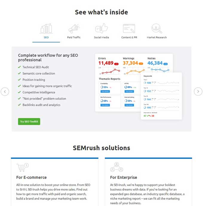
1. Informative Above the Fold Section
The first aspect you need to consider while optimizing your landing page for desktop is the area shown above the fold. Most website users are already assuming that your homepage will continue down the web page, so they’re expecting to see relevant information with their first view.
Crafting an informative above the fold area is all about displaying your brand’s unique value proposition, customer benefits, and the expectations that your prospects can have from your business.
Use this area to capture attention through a relevant background image or interactive graphic that informs your target audience about what they need to know. Some of the elements you may want to include are:
- Product image
- List of benefits/solutions
- List of features
- Money-back guarantee
- Relevant testimonials
Here’s a great example from SEMRush:
2. Attention Ratio
Here’s the most important design principle that can make the difference between a mediocre landing page and a highly successful one. It boils down to the following equation:
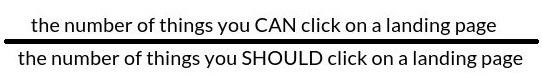
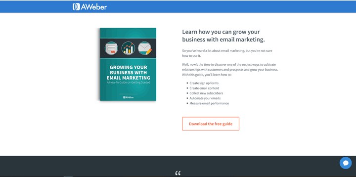
Simply put, you should never overwhelm your visitors with too many choices. Depending on your landing page’s specific objective, create a powerful and compelling CTA (call-to-action) and make sure that it stands out on the page. Landing pages typically have one objective. This landing page Grow Your Business with Email Marketing from Aweber (below) illustrates. Keep your landing page clutter to a minimum.
3. The Flow and Direction
Try to put yourself in visitors’ shoes and figure out their main intentions. The principle of flow and direction suggests that all landing pages should be crafted in such a way that the most obvious cues (text and graphics) are positioned to help the user make a smooth transition from the landing page’s sales copy to the call-to-action.
Give your users simple directions by including obvious or less-obvious pointers. Take a look at one of Uber’s landing pages:
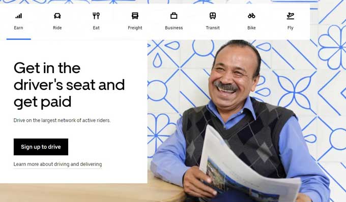
As you can see, the eyes of the man who’s holding a newspaper are pointed towards the headline and CTA.
4. Make Elements Pop Using Contrast
To make an element stand out from the crowd, you should leverage color contrast any time you can. Blue on green, black on red, bold against a minimalistic font – these are useful tactics that will help you make your CTAs stand out from the crowd.
Use contrasts to put all the important visual elements in the spotlight.

5. Highlighting
Highlighting is another essential landing page design element that will help you prioritize certain elements over others. It is very similar to contrast, but mostly used for text.
You should know by now that most people who read sales pages are merely skimming through them. What they’re looking for are really interesting aspects that could be relevant to their needs and problems. For that reason, you should highlight every relevant headline, sub-headline, or piece of text that you believe your prospective customers are likely to read:
6. Plenty of White Space
The purpose of your landing page is to attract the reader’s attention towards the most important elements of your design: CTAs, headlines, and important text.
You have to keep your landing page “breathable” and organic. To do that, use plenty of white space between your text, graphics, and CTAs.
Using white space to improve design is one of the most common strategies in the web design world, and you should put it into implementation.
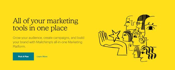
7. Proximity
The principle of proximity states that your page items should have a close relationship with each other. More simply put, every element of your page should be connected in such a way that they become one unit.
When it comes to landing pages, you should complement and support your CTA buttons to make them shine. If you place elements that are taking the attention away from your CTAs, your conversion rates will drop.
Here’s an example from MailChimp:
8. Grouping
Grouping is very similar to the proximity principle. It involves developing a relationship between elements that communicate the same (or similar) message.
Objects that are grouped make the interpretation simpler for users. Here’s an example from Zoom:
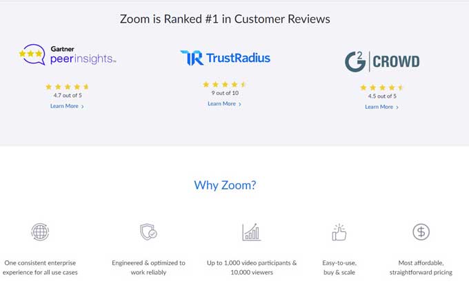 First, they’re featuring reliable customer reviews that improve their brand’s credibility. Second, they provide the main benefits and features of their software. The two elements speak the same message … that their brand is reliable and truly professional.
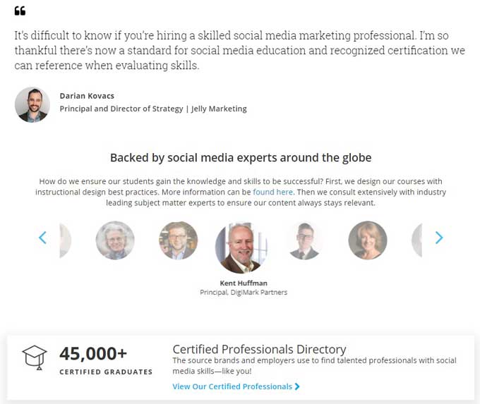
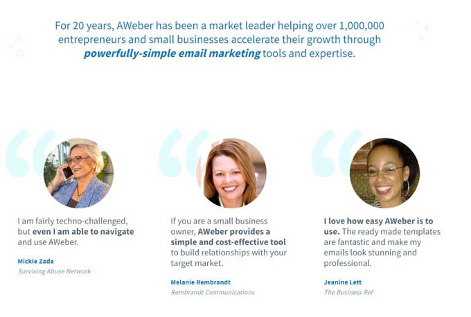
9. Social Proof
To skyrocket your conversion rates, your brand needs to be credible. By designing your landing page with the purpose of making your social proof stand out, you’re giving your potential customers valid reasons to believe that you’re a reliable business that they want to associate with.
Here’s a relevant example from Aweber, one of the leading email marketing autoresponders.
10. Catchy Headlines
The attention of the average internet user is naturally drawn to bold headlines. Even though they may not be fully focusing on your headlines, their eyes can’t help but look at them. By crafting catchy and compelling headlines, users will subconsciously absorb them. For that reason, you should keep your headlines short and relevant, to make it easier for users to understand your core message.
Also, make sure you leverage title case capitalization on every word except for the connecting words like “of, and, it, for, but, etc.”
Here’s a headline example from Hubspot:
Takeaways
The performance of your digital marketing strategy is usually directly proportional to the quality of your landing page design. Your content marketing strategy cannot shine unless it is properly packed and displayed by a professional webpage design.
Getting it right is not easy. You should treat your landing page design as a journey rather than a result. Keep testing, measuring, and optimizing every landing page you develop and don’t stop until you’re satisfied with your results. Leverage today’s principles and take your landing page design to the next level!
 Isabell Gaylord is a professional writer, journalist, and content marketing specialist based in Chicago.
She specializes in such spheres as marketing, business, and education. Isabell contributes frequently to Brill Assignments.
Find her on Twitter @IsabellGaylord.


Leave a comment