


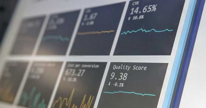
According to one recent study, about two quintillion new bytes of data are created every single day. In the past two years alone, more data was created than in all the other years of human history combined.¹ Over the course of the last decade, businesses in particular have used this massive volume of data for nearly every purpose that you can think of.
They use it to uncover opportunities for process improvements and optimization that would have otherwise gone undiscovered. They use it to empower their employees, allowing them to work "smarter, not harder." They even use this data to communicate important points to members of their target audience via marketing collateral.
Which, of course, is where most of them usually fall into a pretty big (and totally avoidable) trap.
Data, on its own, is totally meaningless. It's just a collection of 1s and 0s on a hard drive somewhere. What that data represents, however, is powerful and profoundly important. The idea behind that data -- the story hidden at the heart of it all -- is what you should be communicating with your target audience, NOT the data itself.
That, ultimately, is what data visualization is designed to help you do.
The Art of Data Visualization: Breaking Things Down
For the sake of example, let's say you just conducted an internal study about all of the charitable contributions that your organization made over the last year. Obviously, you'd want to find a way to let your target audience know about this - it's the perfect way to not only raise brand awareness but to also confirm that your values align with theirs.
But simply including a bulleted list of that data -- meaning point after point of "we spent X amount of money here, and Y amount of money there" -- isn't going to get the job done. Far from it. At that point, you're counting on the data to paint the complete picture...
... and that data is going to fall flat on its proverbial face.
With data visualization, however, you can not only convey that narrative underneath the data, you can do so in a way that is easy to understand and even easier to emotionally connect with.
So instead of just putting out a series of bullet points, you might use a graph maker to create a pie graph (like this one from Visme) of the total amount of money you donated in a year. Then, each sliver of the pie could represent another organization that you and your employees gave money to or otherwise helped out in some way.
Or, you might use a timeline maker to express the same ideas in a totally different way. Instead of money being the thing that you're honing in on, allow it to be time. Visualize the fact that your organization gave money to charitable organizations all year long, not just at the end of the year to collect that sizable tax credit, like most businesses do. Show people that you were out there doing your part to help make our communities better even when people weren't watching.
Then, you could reach out to top journalists in your industry and send highly personalized pitches. Rather than forcing them to uncover the narrative themselves, you've essentially done it for them, meaning they're far more likely to pick up the story and spread it far and wide if it's already so relatable after being visualized.
Yes, data is important, but in a literal sense, it's not nearly as important as people think. Consider the example of business analytics. Businesses spend massive amounts of money on software programs not to collect data, but to process it. To draw out that story that would otherwise go undiscovered due to the sheer mass of information that they're dealing with.
When you incorporate the best practices of data visualization into your marketing campaigns, you're essentially doing the same thing. You're taking business data that is naturally cold and calculated and are turning it into something that anyone can understand and that people actually want to get behind. You're giving them something to latch onto and you're doing so in a way that makes even the most complicated ideas straightforward and relatable.
Make absolutely no mistake about it: the importance of data visualization as a visual marketing tool cannot be overstated.
 Payman Taei is the founder of Visme, an easy-to-use online tool to create engaging presentations, infographics, and other forms of visual content. He is also the founder of HindSite Interactive, an award-winning Maryland digital agency specializing in website design, user experience, and web app development.


Leave a comment